Unraveling the Global Average Temperature: Historical Data, Regional Biases, and Natural Drivers of Climate Variability
An over reliance of the global average temperature is akin to suggesting there is such a thing as a global average phone number.

Over the past decade, I have had thousands of discussions with people on social media over a broad range of climate science related subjects and I wanted to share some important facts that I have learned from these engagements regarding the scientific merit of an average Global Air Temperature (GAT).
I recently produced an in-depth introduction to the topic of how air temperatures have evolved over the Holocene Interglacial, here in this article I will focus on the last few centuries.
Over the years, I have heard many times from other like minded scientists that an average GAT is as meaningful as the average phone number in a telephone book. While I have always chuckled when I hear this saying, I am not entirely of the same mindset on its limited utility, but almost.
Let me show you why.
The entry point to this discussion is to highlight the historical distribution of land based measurement stations in the mid 19th century, as well as the lack of geographical coherence in the changes in GAT since the late 19th century.
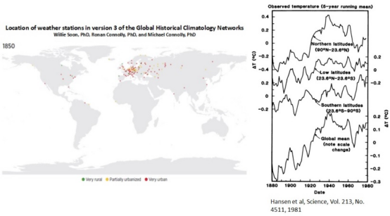
Figure 1. Weather station distribution in 1850, together with zonal latitudinal and global average changes in air temperatures from the late 19th century to 1980.
Figure 1 shows both the Global Historical Climatological Networks weather station locations as of 1850, as well as an illustration from Hansen et al showing both the zonal latitudinal and average GAT changes since 1880.
The Center for Environmental Research and Earth Sciences (CERES) station distribution map for 1850, shows that the vast majority of surface stations were in Europe. Further, CERES demonstrated, using 50 year increments, that a global network was not obtained until the mid 20th century.
This is extremely important to bear in mind, as changes in GAT are always referenced relative to the mid to late 19th century.
This suggests that European stations offer a higher merit representation of the changes in surface air temperatures during the 19th century than does the GAT anomaly.
Note that an anomaly is a fancy word for a difference relative to a constant value.
In this case, the GAT anomaly uses the baseline average over 1951 to 1980 to subtract all temperature values over the time series. Thus, negative (positive) values represent temperatures that are lower (higher) than the baseline period.
Anomalies are commonly used in environmental science when attempting to compare how time series vary, when the absolute values of said time series are significantly different (e.g., tropics versus polar regions).
Given Figure 1 shows a high density of surface stations in Europe during the mid 19th century, it is relevant to examine this record. One of the best studies that I have seen over the past decade that use the European temperature records is a 2014 publication by J. Ludecke et al (Figure 2).
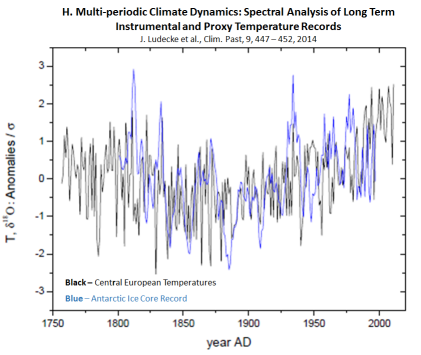
Figure 2. Central European air temperature anomaly versus the Antarctic ice core proxy temperature anomaly (Note: y-axis is anomaly divided by the standard deviation).
J. Ludecke et al plots both data series as a z-score (i.e., anomaly / σ) , which is used in time series analysis and is a unitless parameter due to the fact that a z-score is derived by dividing the anomaly time series by the standard deviation (σ) of the time series (i.e, celsius / celsius).
As the σ is a constant, the variability is indicative of the anomaly in the numerator.
Note that proxy temperatures in environmental science are derived from isotopic ratios, which in the case of ice, is the ratio of both oxygen-16 & 18 (O18 & O16) , as well as hydrogen (H1) & deuterium (H2). As the melting point of H2O is a function of is molecular weight, the ratio of heavier H2O to lighter H2O will vary with temperature and thus forms the basis of how a proxy temperature can be calculated through mass spectrometry.
J. Ludecke et al argues that both Antarctic proxy temperatures and European air temperatures show a similar time dependence over most of the 19th and 20th centuries.
Specifically, we see that temperatures in both Europe and in Antarctic declined over the 19th century and rose over much of the 20th century, and both time series exhibit similar multi-decadal variability over both centuries, such as the peak around 1860 to 1880 and again around 1920 to 1950.
Thus, I argue that perpetrating GAT anomalies that start at the low point in Figure 2, effectively creates a false understanding of history.
Next, I will demonstrate that the over reliance of the GAT anomaly works to create a false impression that warming since the late 19th century has been geographically coherent, while in reality, GAT is statistically biased by the extra-tropical Northern Hemisphere.
Hansen et al 1981 study shown in Figure 1 is a perfect illustration of this bias. Compare the zonal latitudinal temperature anomalies to the GAT anomaly and the similarity between GAT and the extra-tropical (ET) Northern latitude air temperature anomaly is especially apparent.
To further complete this picture, I have included Figures 3a and 3b.
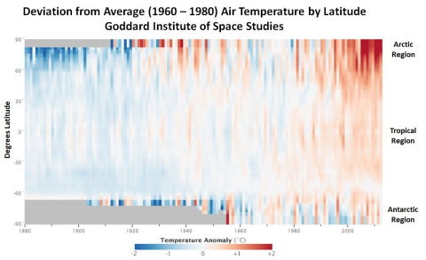
Figure3a. GISS GAT anomaly as a function of latitude and time since the late 19th century.
Note that the grey zones in Figure 3a, along both polar latitudes, indicates the absence of data and the baseline average used to create this anomaly map was the 1960 to 1980 global average. The color coding shows that shades of blue correspond to surface air temperature colder than the baseline, while shades of red are higher.
Figure 3b plots the absolute change by latitude, using much the same data as represented in Figure 3a and it quantifies the strong bias to warming in the Arctic zone (>60 degrees North) and the middle latitudes of the Northern Hemisphere. Note that the warming of the higher latitudes of the Southern Hemisphere is merely 0.05 C per decade - it strains credibility to suggest this rate has any statistical credibility.
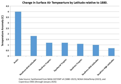
Figure 3b. Surface air temperature anomaly by latitude since the late 19th century.
While I would enjoy doing a deep dive into the numerous hypotheses in the literature on why warming is so strongly biased to the higher latitudes of the Northern Hemisphere, I will simply say that all explanations invoke natural (i.e., non-anthropogenic) mechanisms.
Next, I use publicly available radiosonode (aka weather balloon) data obtained from the National Oceanic and Atmospheric Administration (NOAA) through its NCEP program’s dashboard and will highlight the latitudinal dependence of the monthly average near surface (925 mb) air temperature over the Seasonal Cycle.
This exercise will demonstrate the role of Orbital Mechanics in dictating how the near surface air temperature evolves across the Earth over the Seasonal Cycle as the planet completes its annual transit around our G2V main sequence star.
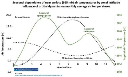
Figure 4. Seasonal dependence of near surface air temperature by latitude.
Figure 4 shows that the peak seasonal temperature lags the point in time over the Season Cycle that the Sun’s vertical position relative to the horizon (aka zenith angle) reaches an annual maximum. In the Northern Hemisphere, the annual peak temperature lags its summer solstice (June 21st) by 3 to 4 weeks, as it does in the Southern Hemisphere (December 21st).
Similarly, two peak temperatures are observed in the tropics and these too lag the Spring and Fall Equinox. The much lower Fall versus Spring Equinox peak temperature highlights yet another fundamental hemispheric difference that exists when comparing and averaging region air temperatures.
Note as well, that on an monthly average basis within the Seasonal Cycle, the Northern Hemisphere exhibits the largest change in near surface air temperature.
This observation is extremely important when we then compare the Seasonal Cycle of the near surface air temperature of the extra-tropical (ET) Northern and Southern Hemisphere to the Global average, as shown in Figure 5.
Notice again that on a monthly average basis over the Seasonal Cycle, the average GAT shows a statistical bias to the Northern Hemisphere. This fact must be considered when hearing people reference changes in the GAT anomaly as being indicative of a geographically coherent occurrence.
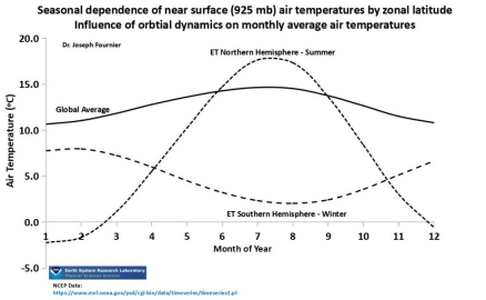
Figure 5. Seasonal dependence of the global average air temperature compared on a monthly basis to the extra-tropical (ET) Northern and Southern Hemisphere.
This statistical bias further justifies a closer look at how changes in near surface air temperature have developed across the ET Northern Hemisphere since the depths of the Little Ice Age.
To this effect, I introduce Figures 6a and 6b, which collectively shows the following regarding the Northern Hemisphere:
The ET latitudes warmed by the greatest extent prior to the 1950s.
The warming experience in the late 20th century is more or less on par with the peak warmth experienced in the 1930s - 1940s.
The 20th century is defined by a multi-decadal cycle of warming-cooling-warming.
The ET latitudes show upwards of a 7 C increase in warming relative to the 19th century low.
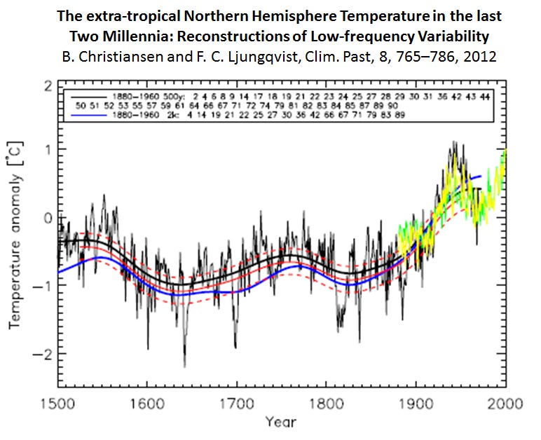
Figure 6a. Extra-tropical Northern Hemisphere air temperature anomaly reconstruction.
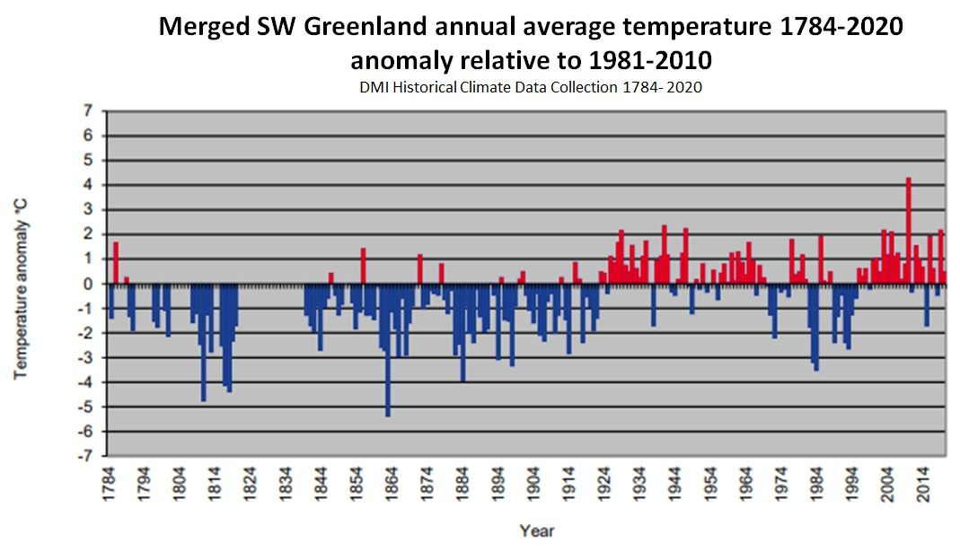
Figure 6b. Air temperature anomaly record for Greenland - Denmark Meteorological Institute (DMI).
Special attention should be paid specifically to the magnitude of change seen prior to the 1950s, which call into question the scientific merit of the arbitrary claims by the United Nations and its supporting agencies that a 2 C warming represents an existential threat to global ecosystems.
The last focus area is the story told by modern satellites equipped to measure the thermal temperature of oxygen molecules through microwave sounding techniques. Since oxygen emits microwave radiation (post absorption) at intensities proportional to its temperature, these measurements allow one to create temperature profiles at various altitudes.
While satellite measurements have only been available since the late 1970s, what they lack in terms of length of records, they make up for in global coverage and precision.
In the closing portion of this article, I highlight clear evidence that GAT is a function of what is called Walker Circulation.
First, I will point out that so far, I have used annual average and monthly seasonal average data.
I will now use what is called seasonal detrending techniques to examine changes in air temperature that develop on an inter-annual basis. Seasonal detrending is simply a 12 month rolling average and is a technique that acts as a low pass filter to smoothen the Seasonal Cycle from the data (i.e., Summer to Winter).
This technique is very important in highlighting changes in atmospheric temperature that develop in response to and at the sub-harmonic frequencies of the El Nino Southern Oscillation (ENSO).
Figure 7 compares the University of Alabama at Huntsville (UAH) average GAT (green) against the Pacific Trade Wind Speed (blue) over the time frame of 2000 to 2025. Both time series have been filtered with a 12 month rolling average.
Note that as the Trade Winds are a vector quantity, a negative value means the winds are originating in the east and moving to the west.
Therefore, when the Trade Winds trend more negative (positive), it means they are accelerating (decelerating) and the Pacific tropics are cooling (warming) and eventually entering La Nina (El Nino) conditions.
The lagging of the UAH average GAT relative to the Pacific Trade Winds is seen when comparing the offset between peaks in both time series.
This lag is the hallmark of a causative relationship.
The lag we observe is like ripples in a pond after a stone is dropped in its center (tropics); it takes time for the wave (heat) to propagate across the pond (Earth).
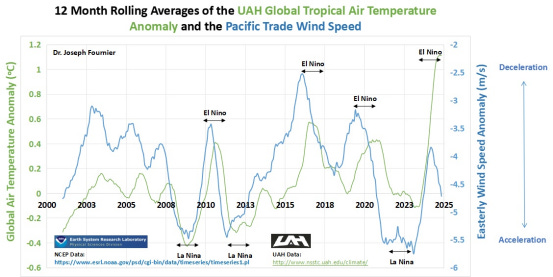
Figure 7. Satellite measured average global air temperatures versus radiosonode measured Pacific Trade Winds (all seasonally detrended).
A close examination of Figure 7 shows that ENSO variations between El Nino and La Nina states is the control knob on the inter-annual variabilities seen in the seasonally detrended monthly averaged GAT anomaly over the 21st century..
This physical relationship is due to the first order influence of the Pacific Trade Winds on variations in Walker Circulation in the equatorial Pacific climate zone, which involve whole scale atmospheric circulation induced changes in both cloud coverage and thermal energy storage in the thermohaline across the Pacific Tropics.
It is increasingly understood that a sudden deceleration of the Trade Winds and the slowing of Walker Circulation in the Pacific tropics, give rise to increased absorption of sunshine as cloud cover retracts in the eastern Pacific tropics, which in turn results in warming sea surface temperatures (aka El Ninos).
The reverse of this pattern results in a return to a neutral or La Nina ENSO state.
Figure 8 is a select figure from a 2024 study that demonstrates this relationship between sudden reductions in low altitude (aka marine stratiform) clouds in the eastern tropical Pacific and along northern mid-latitudes that was observed by satellites during the 2023 to 2024 El Nino event.
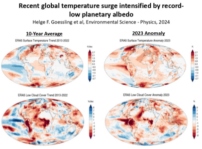
Figure 8. 2024 publication demonstrating ENSO’s controlling influence on the planetary albedo (reflectivity).
Note that we do not understand the physics causing these irregularities in Walker Circulation in the Pacific tropics, nor how these tropical irregularities affects with bias, the higher latitudes of the Northern Hemisphere.
What we simply know is that this relationship behaves analogously to domino's, with the Pacific tropics leading and the Northern Hemisphere following as if it is teleconnected to ENSO’s influence on Walker Circulation.
In closing, I hope that my representation of this topic challenges your high level understanding, while providing an alternative way of looking at this thing called the Global Air Temperature (GAT). My final recommendation is to ignore the claim that GAT anomaly represents a globally coherent trend.
Hey Joseph, I am going to have to read this one a couple of times before I take the test.😉 I am about 40-50% absorption so far. I do get the part GAT not being representative. In my sphere of specialization-designing non-damaging drill-in fluids for open hole oil well completions, you would be amazed at how prevalent using average reservoir pore diameters for forming a bridging/sealing layer on the formation face is. 🤣 Anyway my question related to this piece relates to the rate of acceleration in GAT that climate alarmists use when citing a "climate emergency." Can you help me with that? Their favorite thing is to take that rate of change and extrapolate to infinity. Many thanks, Dave
Please note: "While satellite measurements have only been available since the late 1970s, what they lack in terms of length of records, they make up for in global coverage and precision." This needs correcting. Global coverage yes. Precision, no. Satellite data needs constant recalibrating against surface measurements. See 1:https://doi.org/10.1038/s41597-019-0236-x
2: https://doi:10.3390/rs12203369 3: https://doi.org/10.1016/j.rse.2019.111366